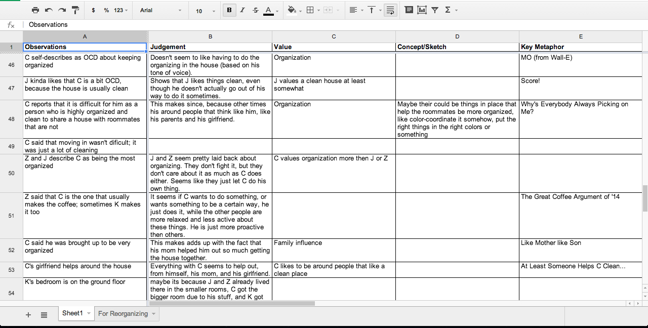
Spreadsheet from the project
The Elito method was the first analysis method we used, and it is basically based off brute force thinking.
The nature of this method is definitely data analysis, since you use it to analyze data. The context that you will use this method is if you have a lot of data you need analyzed, you could use this to get that done.
Description of the Method[]
Basic description
"The Elito method is used to develop solid design arguments grounded in research
observations and anchored to business directives." - Martin and Hanington, Universal Methods of design
This method is all about getting observations you got from the research, by filling out a sheet with five different columns, which are listed out bellow.
- The "Observations" are the bits of raw data you want to analyze, and they fill out the first column in it.
- The "Judgements" are the next column, and they are the judgements you make off the observations you see.
- The "Values" are the middle column, they are the value you see the subject has based off the observation or the judgement you made.
- The "Concept/Sketch" is the next column, and they are basically design directions you can go with for each one based off your observations, judgements, and values.
- Finally, The "Key metaphors" are the last column, and to me they are just little metaphors you have to remember them better, I usually try to make them a joke for fun.
You do this through a data sheet, where you write all of these down one by one. First you start with observations, you should right down a lot of different observations down, as many as you can actually. You do this first because this is a form of the Inductive approach, where you examine the data first and see where they naturally chunk into. After that, you can fill the rest of them kind of how you please, since doing them out of order is fine, in fact it can sometimes get you unstuck. So basically now you have to fill the rest of them out.
Also this method was named after Eli.
Actually Doing the method
First you start with observations, you should right down a lot of different observations down, as many as you can actually. You do this first because this is a form of the Inductive approach, where you examine the data first and see where they naturally chunk into. You should probably do this through a file sharing website, for instance, Google drive using there datasheet thing. You want to use a file sharing one so all of the people who worked on it can help make this. After that, you can fill the rest of them kind of how you please, since doing them out of order is fine, in fact it can sometimes get you unstuck. So basically now you have to fill the rest of them out.
To do this, you basically have to sit down and force ideas out for each one, making as many judgements, finding many different values, and forcing ideas out for nearly all of them. This is also meant to connect different lines on the data together, and you can move them around to better connect them together. You can move them around by either printing them out, cutting each of them up, and moving them around, or you can do it by doing it online through the spreadsheet you used to make the Elito sheet to begin with.
Now you just basically have to keep doing this til a majority of all the spaces are filled out, and you should have a lot of potential design directions to go with.
Positives and negatives[]
Positives
- You are forced to make new and different ideas off random observations.
- Helps you analyze a lot of data and make sense of it.
- Forces you to look at each piece of data, piece by piece.
Negatives
- Can take a long time to do
- Could get stuck easily
- Its a brute force method, and those can be bad.
Tips and Tricks[]
- If you get stuck, move onto another column and then come back, sometimes working on other ones can bring new light to the situation.
- Try to make the observations not that complicated, make them as bare as they can.
- Work on this at the same time as someone else, so you can work off each other
- Take breaks, don't work on this for over 5 hours like I did.
Project we used it for[]
We did this to figure out more information off the first group project we did, which was clutter in the home for the ethnography/field observations project. We ended up doing this through Google drive, and took way longer then we first thought. We got stuck a lot, and felt like a never ending process. We ended up writing down around 100 observations, and it was a pain to get all of it out. Not only this, but I think we ended up doing it wrong, and ended up not filling up all of the spots. Definitely not our finest work.
We ended up not cutting them out, but I kind of wish we did in the long run, I feel like it really would have helped us out more. May have made it better for visually seeing the data and moving it around.
We also had a lot of arguments about what to put where, which also increased the time making this chart. One of the biggest arguments was how to organize it, since we both had our own way of doing that. To solve this, we ended up making two different charts, though I think there was a better way of handling this.
Hughes's Corner[]
Have to be honest, was not one of my favorites, but I still don't think its the worst method that we did. Though I do like the whole key metaphors part, that made it kind of fun thinking of clever names for all the observations. We kind of used that in conjunction with Affinity diagrams for the final project, for some of the groups we made in it we named them clever names to help remember them.
This method can take forever, which I found really annoying, and its also easy to get stuck on sections and filling out as much as you can will get very annoying. I do not see why someone would use this over Affinity diagrams.